


Warm Colours vs Cool Colours: A Practical Guide for Artists
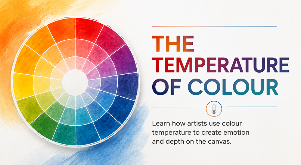
Colour theory can feel overwhelming when you first encounter it: complementary colours, analogous palettes, saturation, and value. But if there's one concept worth understanding before anything else, it's colour temperature. It quietly sits behind most decisions a painter makes, and getting a feel for it tends to make everything else fall into place.
Warm colours and cool colours aren't just categories. They're tools. And like any tool, they work best when you understand what they're actually doing.
Warm Colour Palette: What It Brings to a Painting
Warm colours come forward. They claim space, draw the eye, and suggest light. In a landscape, warm tones in the foreground push it closer. In a figure painting, warm light on skin gives it weight and presence. In abstract work, a single warm passage in the right place can anchor an entire composition.
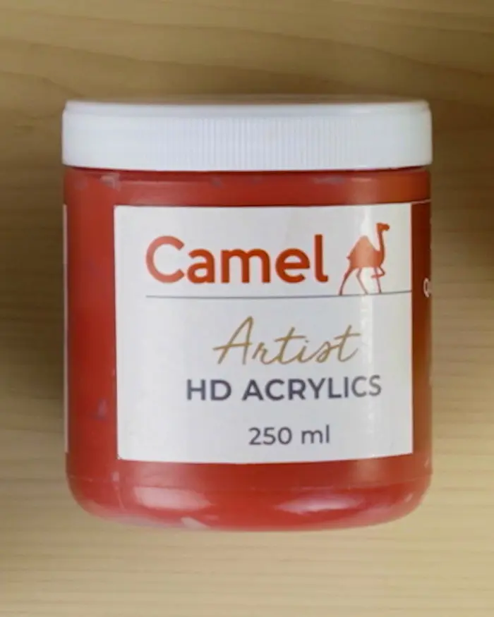
Camel Artist Oil Colours are well suited to warm-toned work shades like burnt sienna, raw umber, and cadmium yellow; they have a natural richness that deepens with layering. For a more immediate approach, Artist Acrylic Colours and Artist HD Acrylics offer strong pigmentation that holds up well in warm mixes without going chalky. Camel Artist Gouache Colours are worth exploring for their flat, opaque warmth, particularly effective in illustration and design-forward work. Those who work in dry media will find that Artist Oil Pastels carry warm tones with a directness and intensity that suits expressive, gestural styles.
Cool Colour Palette: Painting Shadows and Depth
Shadows are where most artists first start thinking seriously about cool colours and rightly so. Natural shadows almost never read as simply darker versions of the lit surface. They shift in temperature, usually cooler, sometimes dramatically so. A warm ochre wall in sunlight will sit in shadow that leans towards violet or cool grey. Getting this right is often the difference between a flat painting and one that feels like it has real light moving across it.
Camel Artist Water Colours are a natural home for cool tones. The transparency of the medium lets blues and blue-greens build in layers that feel luminous rather than heavy, ideal for skies, reflections, and the soft cool light of overcast scenes. Artist Soft Pastels handle cool gradations with ease, blending across large areas without muddying. For detailed line work within a cool-toned composition, Fine Liner Pens offer precision and consistency.
When Both Work Together
Most paintings need both. The interaction between warm and cool is where depth, light, and mood actually come from. Warm light needs cool shadows to feel convincing. A cool background makes a warm subject advance. Push one, and the other becomes more powerful by contrast.
Working on Artist Water Colour Paper gives watercolour artists a surface that handles the back-and-forth of warm and cool washes without warping or breaking down. It's important when you're building up temperature relationships across multiple layers.
Final Thoughts
The most practical shift is to stop thinking about shadow as "darker" and start thinking about it as "cooler." Try it on a single study, keep your lights warm, push your darks cool, and see how the painting reads differently at the end.
Colour temperature isn't something you master once and move on from. It stays in the conversation every time you mix a colour or look at what isn't working. The artists who use it well rarely make a big show of it; it just quietly makes everything in their work feel more considered, more real, and more alive. That's what Camel is built around: giving you the tools to explore these decisions without the medium getting in the way.
Frequently Asked Questions (FAQs)
Q. How do warm and cool colours affect a painting?
A. Colour temperature plays a major role in how viewers perceive space and mood. Warm colours tend to advance visually, while cool colours recede. By balancing the two, artists can create contrast, guide the viewer's eye, and make a painting feel more dynamic and realistic.
Q. Why are cool colours often used for shadows?
A. Shadows in nature are rarely just darker versions of an object's local colour. They often contain cooler tones due to the influence of ambient light from the sky and surrounding environment. Using cool colours in shadows helps artists create more convincing light effects and a stronger sense of form.
Q. Can a colour be both warm and cool?
A. Yes. Colour temperature is often relative rather than fixed. For example, one blue may appear warmer than another blue if it contains hints of violet, while a green can feel warm when it leans toward yellow. Artists frequently compare colours within a palette rather than assigning them a permanent temperature.
Q. How can beginners learn to use warm and cool colours effectively?
A. One of the best ways is through observation and simple colour studies. Try painting a subject with warm highlights and cooler shadows, then reverse the approach in another study. This exercise helps develop an understanding of how colour temperature influences depth, light, and mood.
Q. Why is colour temperature important in painting?
A. Understanding colour temperature helps artists create more believable light, stronger contrast, and greater visual depth. Even a simple shift from a warm tone to a cool one can change how a painting feels, making colour temperature one of the most valuable tools in an artist's toolkit.
Did this article help you learn something new?
Share your thoughts with us in the comments below.
Leave a comment


Comment added
Comment updated
Comment deleted
More inspiration


“
“Don’t be conscious.There will be someone, somewhere who will appreciate your work.”