
Colour harmony in your art is achieved when all the different elements come together seamlessly. It is imperative to note that harmony does not mean monotony. In fact, colour harmony will have many different basic elements such as colour, lines, and the principles of art like proportion, rhythm, contrast, movement, proportion, and variety. Even if the elements repeat, they will look like they are adding up to contribute to a whole.
When it comes to creating colour harmony in art, getting familiar with each of the basic elements mentioned above can be used solo or in different combinations with one another. If you educate yourself about these basics, you are more likely to find certain fluency while creating art. So if you are wondering how to get harmonious colours in paintings, then you are on the right track.
Just as colour harmony does not indicate monotony, it does not indicate chaos either. It has to be the perfect combination of the two and can be conveyed in a variety of ways. Using colour as your primary vehicle for creating harmony in your painting, you can explore different forms of painting.
Different ways to create colour harmony
1. Analogous colour schemes
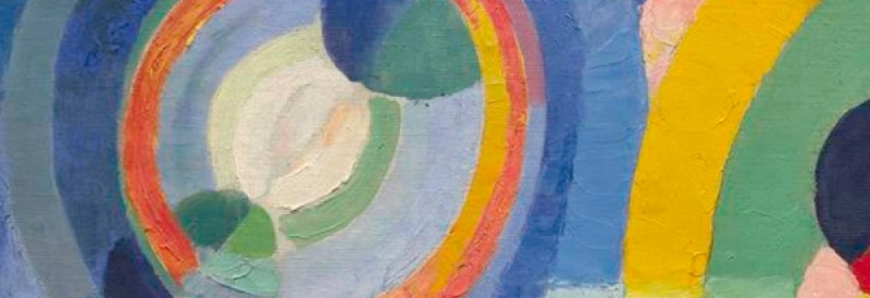
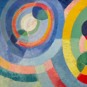
Colours have the power to draw you in, making you want to try creating artwork. You can also create colour harmony by using analogous colour schemes - colours in groups of threes that are next to each other in a colour wheel.
2. Colour values
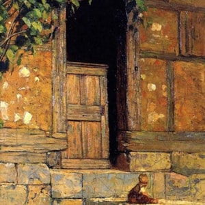
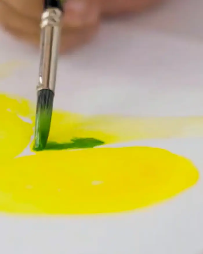
Another way of ensuring that you can use colour harmony is to remember the values of colours used. Whether or not the colours used are bold or subtle, for the painting to appear natural, the colours in the painting must share a relationship that can be established through colour values that are similar. If this does not happen, the painting may appear unnatural.
3. Forms and marks
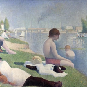
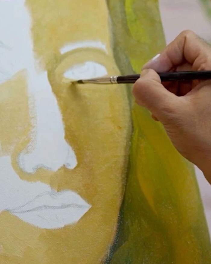
The human eye can’t see all the details in a picture all at once. When you focus on one detail of the picture, the others get blurred into the background. To be able to paint the image that you see accurately, you need to experiment with forms and marks. Make sure that the forms and marks are harmonious, also depending on how you see a particular scene/picture.
4. Soft edges vs sharp edges
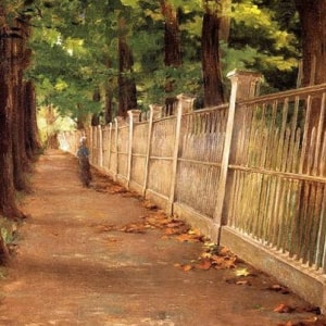
How you paint the edges of shapes in the painting affects the perspective of the viewer. Painting softer edges works best to indicate more distance while painting sharper edges works best when indicating longer distances. Harder edges can be painted when you want to bring features such as patterns and textures into focus.
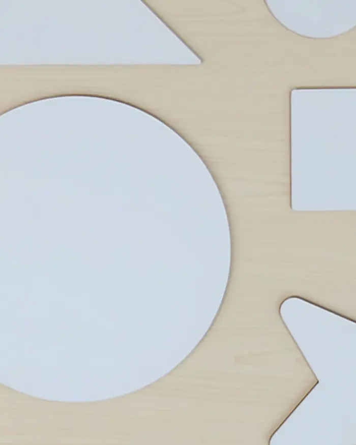
5. Shapes and proportions
The shapes that you paint as having characteristics that are similar will look like they are in harmony with each other. If you want to create a visual discord on purpose, you can introduce shapes that have jagged lines instead of curved borders.
When you want to create a good balance using proportions, it is generally a good idea to have different shapes in a consistent size ratio instead of having the same shape in different sizes.
All in all, there are rules for painting using colour harmony but the aesthetics everyone goes for may differ from individual to individual. The strategies presented here will aid you to get better at creating colour harmony. Make the best of it!
Did you find this article on how to create harmony in art useful?
Share your thoughts with us in the comments below.
Leave a comment
I am a self taught guy, finding results doing things practically, the articles are very helpful.
September 28, 2024
Comment added
Comment updated
Comment deleted
More inspiration
“
“The world always seems brighter when you've just made something that wasn't there before.”